TL;DR: Client wanted a sleek and modern refresh to their Amazon Store. This included a robust redesign in the layout, copy, and graphics. After the revamp, visitor traffic increased by 65%.
The Context
This client wanted to refresh and modernize their Amazon storefront. The goal was to increase brand awareness and drive sales.
The Problem
The client’s current Amazon storefront at this time was the default from Amazon. The site lacked proper branding, informative copy callouts, and was not aesthetically pleasing. They felt they could market and sell more product if their store was more attractive and cohesive.
The Process
First I needed to empathize with this client on their pain points. We had a brief phone call regarding their wishes for the new storefront. Ultimately, they allowed me to have creative freedom with this process. Their only requirements were that it look clean and modern.
I was able to clearly define our customer base through Amazon’s reviews on these specific products. By reading through all the reviews, it became clear that this client’s customers were mainly women between 20 and 50. The challenge here is to make the new store modern enough to appeal to both the younger and older ends of the age range. Another challenge was having to work with the existing photos. Ideally, I would like to have been able to restyle these models into more trend-right outfits, but budget and time did not allow for this.
Working through the analytics on the Amazon Vendor site, I was able to determine which products were of most importance. Ultimately, this gave me a starting point for the product hierarchy. I needed to determine how the products should be grouped and which were of utmost importance to be featured on the homepage. I did take feedback from the client that they were pushing their faux leather styles. I bounced around between styles considering all important aspects of the products.
- What important callouts are needed to sell this product?
- What is more important for customers to see?
- Can I include social proof somehow?
- Are there any limitations from Amazon that will prohibit any of these design ideas?
After some review of product pages and browsing other brand’s storefronts, I began to play around with the template layout. Luckily, Amazon does make it relatively simple to design the layouts but you are limited in your design too.
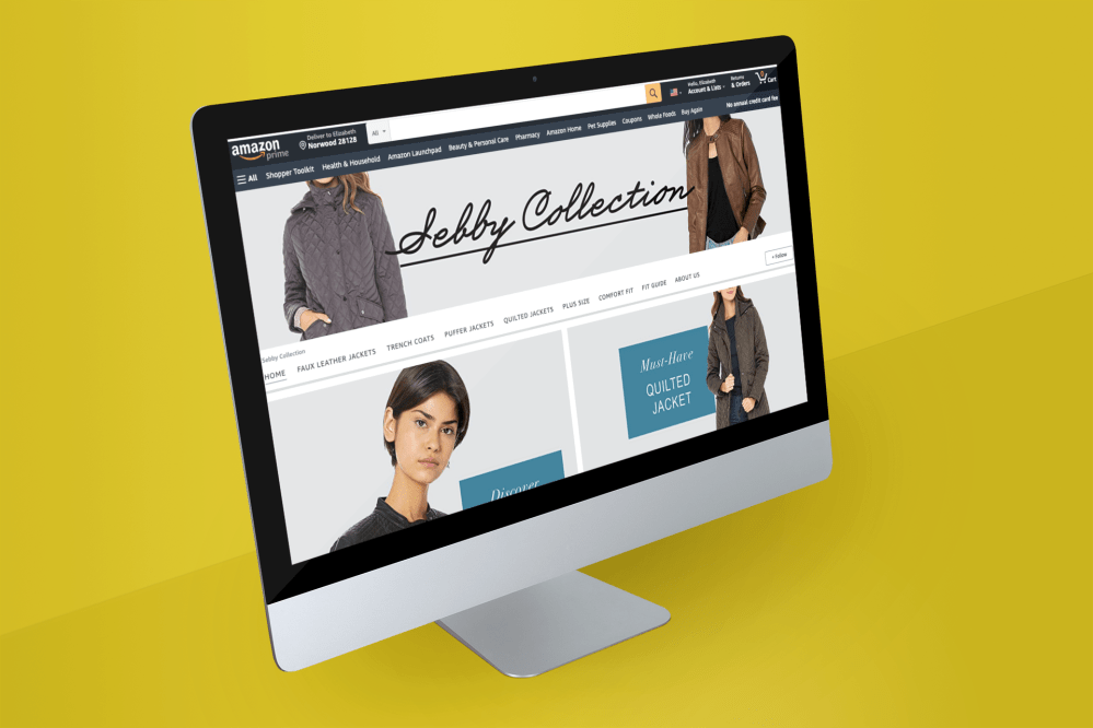
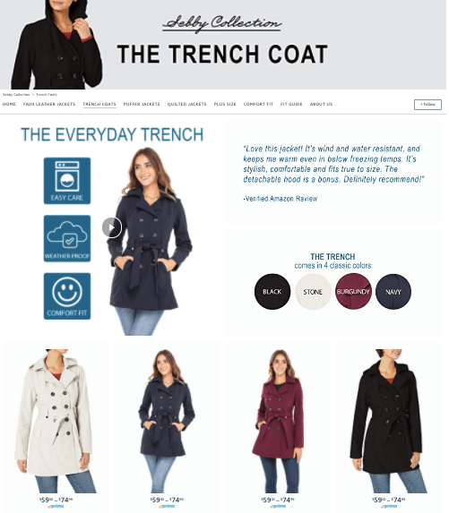
New homepage that is both informative and modern.
Now that the homepage was organized, it was time to dive into each individual product page.
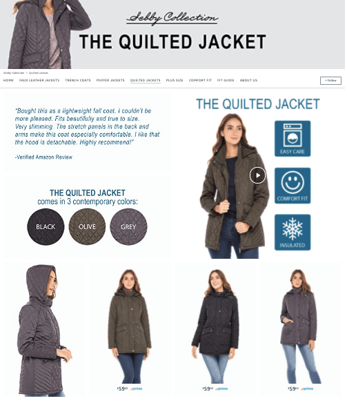
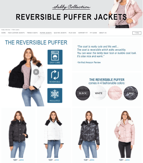
Each product page would include:
- Shoppable images
- Social proof
- Easily identifiable icons
- Available colors
- Descriptive copy
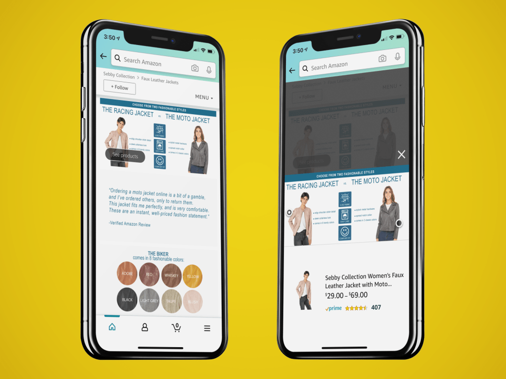
‘See Products’ button allows customers to easily find and shop.
The last step was to create promotional videos that the client could push on Amazon. In order to create a cohesive story, I used the same imagery from the storefront and created videos in Biteable. The goal for the promo videos was to increase traffic to the product pages.
Now that the designs were complete, we submitted the new store design to Amazon for approval. After about 48 hours, we were granted approval from Amazon and the new store went live. The client and I continued to monitor the site’s analytics over the next few months.
The Results
After a few months of the site being live, the visitor traffic had increased by 65%. This was peak holiday shopping season time so there was most likely added traffic for this reason. The conversion rate is still not ideal. Based on Amazon’s analytics page the current conversion rate is 3.9%.
Next Steps
The client will continue to monitor the store’s analytics. We will revist the site design next season to update styles, colors, and refresh the homepage. I’ve suggested that they consider adding plus size models to their assortment to better represent the product. The client plans to shoot a new Fall campaign and we will update the store at that time.
