TL;DR: This project is my redesign for a corporate apparel manufacturer website. I wanted to bring their dated website into the modern era. This case study walks through my design process. The goal is to have a modern, informational website that helps to gain new clients and acts as resource for current clients.
The Context
This corporate website is completely dated. I want to modernize their digital footprint with an informational and aesthetically pleasing website. This project is currently being worked on, but the up-to-date process can be found below.
The Problem
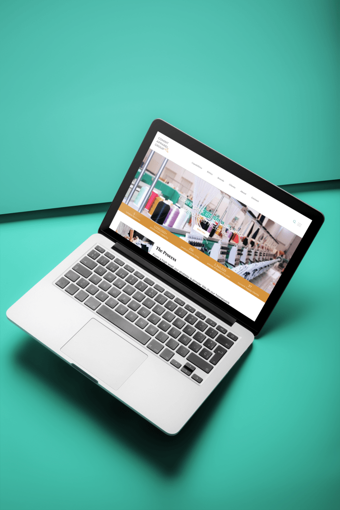
Most all of of today’s website’s are sleek and modern with eye-catching imagery and interesting typography. This corporate website lacks all of the above. The website’s architecture is repetitive, bulky, and overall lackluster.
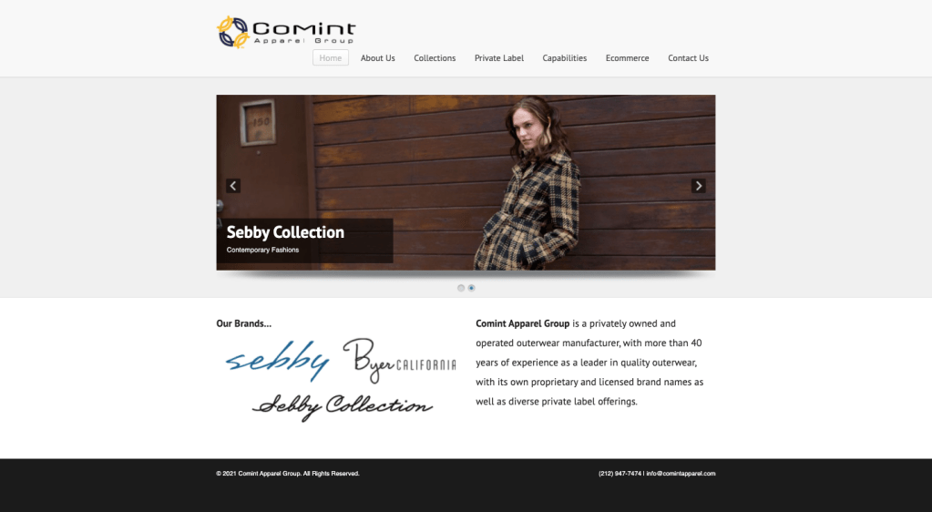
The current website is not responsive, heavy to the eye, and quite dated.
Empathize
It’s easy to discover the problem here. This website is not functional in today’s world. It’s no longer serving this company as it should. Both current and potential customers should be able to use this website as a resource to gain more information about this company’s manufacturing process and their private label capabilities.
Define
Some challenges we will face here will be finding the perfect balance between focusing on the companies main manufacturing business, while also including their e-commerce side. The pain points from the client’s side are mainly the aesthetic being dated and
Ideate
- What is the most important information we want to represent?
- Is there anything we would like to add to the website that is not already represented?
- What opportunities can we create with a new website?
- Are there any special website functions we need to include?
- I’ve started this project by first sketching and doodling some ideas on how to better lay out the homepage. I spent a good bit of time researching other apparel manufacturer websites, making note of their specific layouts and details.
Protoype
Now the fun part! I dissected the current website on a whiteboard with sticky notes. This layout helped me to see the overall architecture of the site and ultimately what could be rearranged. A lot of the information was repetitive and not laid out in a fluid way. Then, I sketched out the homepage and applied points to each element on the page, before the fold. This hierarchy is useful in determining what elements are most important for the design.
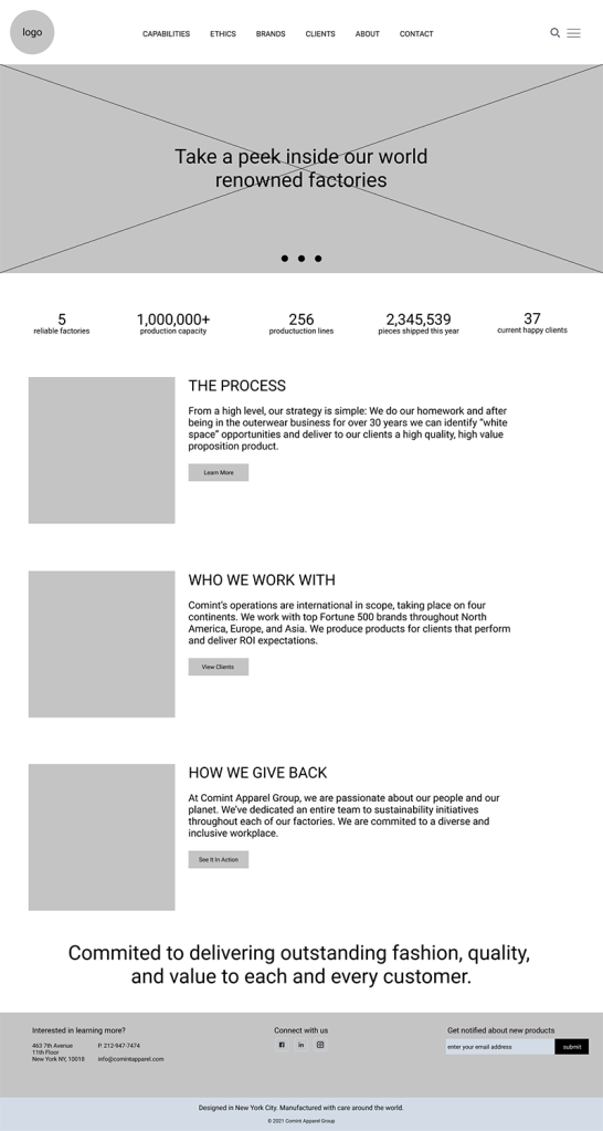

The Results
This was just a quick redesign of the homepage. I am still working on variations of this product.
However, I am really pleased with how the site has transformed from dark and contained to light and modern.
More to come on this guy!